Poster Two Process -Void#DES101
- Robert

- Apr 8, 2020
- 2 min read
Updated: Apr 9, 2020
For Design 101, the task was to create a movie poster based on the haiku that we chose.
Apply principles of color theory, include textual elements (e.g. movie name, director) considering organisational principles of typography and carefully think about signifier and signified

First, I brainstormed my movie title ideas, and I also used a few words from Poster 1 brainstorming as well. As my haiku is about a speaker missing her dead friend, I came up with words that show sadness and sorrow.
After choosing my three favorite titles which were Void, Agony and Miss the Moment, I started to draw brief ideas of my movie posters. From the photo below, I believe human figures are the simplest but strongest things that can emphasize the emotions, so I mainly used human figures to show sadness more clearly. While drawing my posters in different ways, I tried to use empty holes and fire to represent my key theme from Poster 1. And below the brief poster designs, I have done some designs for text and credits positioning as well.
After finishing my brief design, I focused more on detail poster design, in which I decided to use the back side of a human figure. After a few ideas, I decided to use Void as my title and use my back as the final poster design.

I took a photo of my back after deciding the rough final design. I tried many different positions, for example sitting down, lying down, standing up straight and twisting my body. Then, I made a conclusion that just the back of my body with my head turned around a little bit was the best.
The reason why I took my shirt off was I thought by showing the naked body, it would show more inner emotions.
The photos above are the process of my Photoshop work. Firstly, I erased my face to convey the emotion of missing a friend. After that I cropped out my body from the original photo. After cropping out, I chose a dark sky as my background to give a dark and gloomy mood, which fits my theme. With my chosen background, I played with the contrast levels to know which effect looked better. With the final design of my background and myself, I worked on the position of my title and the credits.
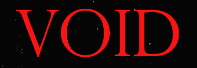
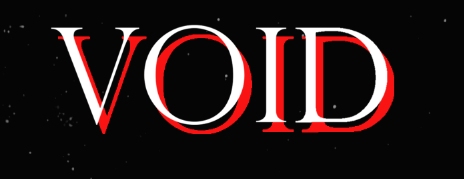
While I was choosing my font, I knew what kind of font would work well with my poster. I thought using the Gothic font would fit my poster, which suits really well my dark and sad theme. So I used Letter Gothic Std as the font of my title. At first I only used the white VOID font, but I thought adding the same font at the back with the red colour would give more impact.
With regard to the credits on the edge of the poster, I tried to use the same font used in real posters and just wrote fake credits.


Comments